Dashboard & Charts
Understand your monitoring data at a glance. This guide explains every chart, panel, and control available in SysTeam HealthChecks.
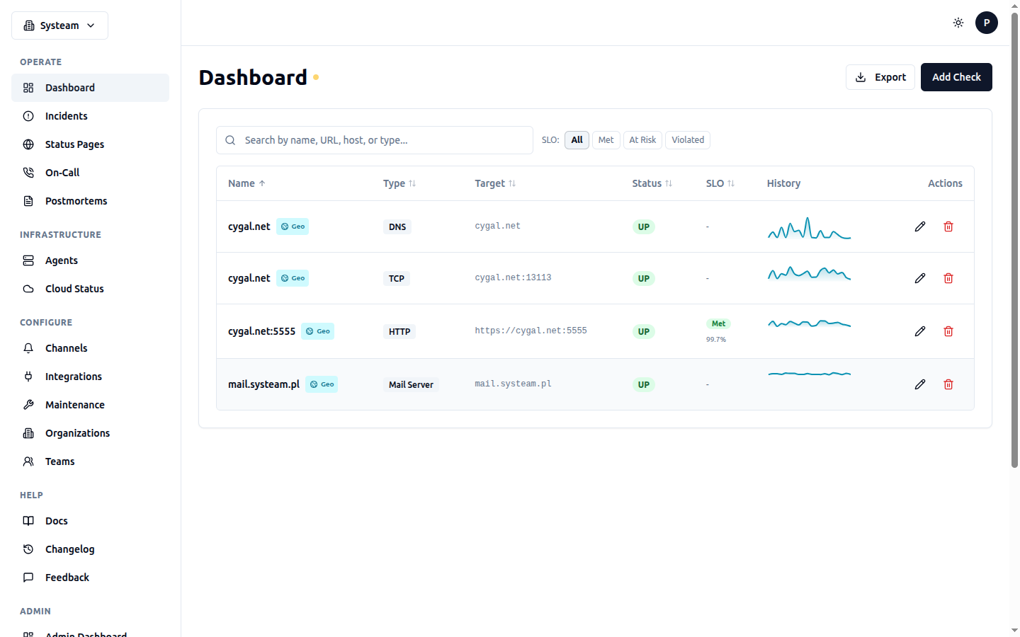
The main dashboard showing all checks with status, SLO, and history sparklines
Dashboard Overview
The main dashboard (Dashboard in the sidebar) shows all your checks in a single view. Each check appears as a row with key information:
| Column | What It Shows |
|---|---|
| Status | Current status indicator (colored dot): UP (green), DOWN (red), DEGRADED (amber), LATE (orange), PAUSED (gray), NEW (gray) |
| Name | Check name. Click to open the detail page. |
| Type | Check type: uptime, icmp, tcp, dns, heartbeat, mail_server, etc. |
| Response Time | Latest response time in milliseconds. Color-coded: green (<500ms), yellow (500-2000ms), red (>2000ms). |
| Uptime (24h) | Percentage of time the check was UP in the last 24 hours. |
| Last Check | Relative time since the last check ran (e.g., "2 min ago"). |
| SLO | If an SLO is configured: shows the error budget remaining as a small progress bar. Green = healthy, yellow = warning, red = breached. |
Filtering & Sorting
Use the controls above the table to narrow down your view:
- Search — Type a check name to filter by name
- Status filter — Show only checks with a specific status (UP, DOWN, DEGRADED, etc.)
- Type filter — Show only checks of a specific type (HTTP, ICMP, DNS, etc.)
- SLO filter — Filter by SLO health: All, Healthy, Warning, Breached
- Sort — Click column headers to sort by that column
Quick Actions
- + New Check — Create a new check (top right)
- Export — Download a report (CSV, JSON, or PDF) for all visible checks
- Pause/Resume — Toggle monitoring for a check via its action menu
Check Detail Page
Click on any check name to open its detail page. This page contains all the monitoring data, charts, and configuration for that check.
KPI Summary Pills
At the top of the detail page, you'll see a row of KPI pills showing key metrics at a glance:
| Pill | What It Shows |
|---|---|
| Status | Current check status with colored background |
| Response Time | Latest response time in ms |
| Uptime (24h) | Uptime percentage over the last 24 hours |
| Incidents (24h) | Number of status-change incidents in the last 24 hours |
| Avg Response | Average response time over the selected time range |
Response Time History Chart
The main chart on the check detail page. It shows response time over time as an area chart.
Reading the Chart
- X axis — Time. The range depends on the selected time period.
- Y axis — Response time in milliseconds.
- Area fill — The colored area under the line. Green when UP, red sections when DOWN.
- Hover tooltip — Hover over any point to see the exact time and response time value.
Time Range Selector
Above the chart, you'll find time range buttons to control how much history is displayed:
| Button | Range | Data Resolution |
|---|---|---|
| 1H | Last 1 hour | Every data point |
| 6H | Last 6 hours | Every data point |
| 24H | Last 24 hours | Every data point |
| 7D | Last 7 days | Aggregated (5-min averages) |
| 30D | Last 30 days | Aggregated (hourly averages) |
Zoom Controls
You can zoom into any section of the chart for a closer look:
- Mouse wheel / trackpad scroll — Scroll up to zoom in, scroll down to zoom out. The zoom centers on your cursor position.
- Click and drag — Click on the chart area and drag to select a specific time range to zoom into.
- Reset Zoom — Click the reset button (or double-click) to return to the full time range.
Tip
Zooming is particularly useful on the 7D and 30D views. Zoom in to see individual data points instead of aggregated averages.
Response Time Source Toggle (Geo Checks)
For checks with geo monitoring enabled, an additional toggle appears above the chart:
- Default Location (star icon) — Shows response time from your preferred/starred location only. This gives you a single, consistent perspective for trending. The default location can be changed in the check's geo preferences.
- Average — Shows the average response time across all active (non-excluded) locations. Useful for seeing overall performance trends.
This toggle only affects the main response time chart. The separate geo-specific charts always show all locations.
Uptime History Bar
Below the response time chart, you'll see a horizontal bar chart showing uptime history. Each segment represents a time period:
- Green segments — Service was UP during this period
- Red segments — Service was DOWN during this period
- Amber segments — Service was DEGRADED (partial failure, e.g., some geo locations down)
- Gray segments — No data (check was paused or not yet created)
Hover over any segment to see the exact time range and duration of that status.
Incident History
The Incidents section lists every status change (UP → DOWN, DOWN → UP, etc.) with timestamps, duration, and details:
- Started — When the incident began (status changed to DOWN or DEGRADED)
- Resolved — When the service recovered (status changed back to UP)
- Duration — How long the incident lasted
- Cause — Error message or reason for the status change
Tip
For heartbeat checks with a cron schedule, timestamps are shown in the check's configured timezone (e.g., Europe/Warsaw) so you can easily correlate with your job schedule.
Check Logs
The Logs section shows every individual check execution with detailed results:
- Timestamp — When the check ran
- Status — Result of this specific run (UP or DOWN)
- Response Time — How long the check took in milliseconds
- Details — Status code, error message, or other check-specific data
Click Show output on any log entry to see the full trace details (HTTP headers, response body preview, SSL info, DNS records, etc.).
Trace Details
Expanding a log entry shows trace details specific to the check type:
| Check Type | Trace Details Include |
|---|---|
| HTTP | Status code, response headers, body preview, redirect chain, SSL certificate info, timing breakdown (DNS, TCP, TLS, server processing, content transfer), security headers score |
| TCP | Connected status, response time, banner (if any) |
| ICMP | Packets sent/received, packet loss %, min/avg/max RTT |
| DNS | Resolved records, query time per server, record values |
| Heartbeat | Ping source IP, request body/output, exit code, duration |
| Mail Server | SMTP/IMAP/POP3 results, SPF/DKIM/DMARC validation, RBL results, SSL certificates, overall score and grade |
If a check was executed by an agent (private or geo), the trace will show a "via Agent" label with the agent name.
Geo Monitoring Panels
These panels appear only for checks with geo monitoring enabled. See the Agents & Geo Monitoring page for detailed descriptions.
- Geo Status Map — Current status per location (colored cards)
- Geo Response Time Chart — Multi-line chart with per-location response times
- Location Comparison Panel — Side-by-side latency comparison
- Geo Histogram — Timeline of status history per location
SLA Panel
The SLA panel shows uptime statistics across multiple time windows:
| Period | Shows |
|---|---|
| 24 hours | Uptime %, incident count, MTTR |
| 7 days | Uptime %, incident count, MTTR |
| 30 days | Uptime %, incident count, MTTR |
| 90 days | Uptime %, incident count, MTTR |
MTTR (Mean Time To Recovery) is the average time it takes for the service to recover from an incident. Lower is better.
Active maintenance windows are excluded from SLA calculations — planned downtime does not count against your uptime percentage.
SLO Panel
If an SLO (Service Level Objective) is configured for the check, an additional panel appears showing the error budget:
- SLO Target — Your configured uptime target (e.g., 99.9%)
- Current Uptime — Actual uptime percentage over the SLO window
- Error Budget — Visual gauge showing how much downtime budget remains
- Budget Status — Green (healthy), yellow (warning), red (breached)
See the SLA & SLO page for details on configuring SLOs and error budgets.
Status Badges
At the bottom of the check detail page, you'll find embed codes for status badges. These are SVG images you can embed in your README, website, or wiki:
- Status badge — Shows current UP/DOWN/DEGRADED status
- Uptime badge — Shows uptime percentage (e.g., "99.95%")
Embed codes are provided in both Markdown and HTML format. Badges are public and do not require authentication. See the Status Pages docs for more details.
HTTP Timing Breakdown
For HTTP checks executed by agents, the trace details include a detailed timing breakdown:
| Phase | What It Measures |
|---|---|
| DNS Lookup | Time to resolve the domain name to an IP address |
| TCP Connection | Time to establish the TCP connection (SYN/SYN-ACK) |
| TLS Handshake | Time to complete the SSL/TLS handshake (HTTPS only) |
| Server Processing | Time from request sent to first byte received (TTFB) |
| Content Transfer | Time to download the full response body |
This breakdown helps you pinpoint exactly where slowdowns occur. For example, high DNS lookup time suggests DNS server issues, while high server processing time points to backend problems.
Security Headers Score
For HTTP checks, the agent evaluates security headers and assigns a score from 0 to 100:
| Grade | Score Range |
|---|---|
| A | 80-100 |
| B | 60-79 |
| C | 40-59 |
| D | 20-39 |
| F | 0-19 |
Headers evaluated include: Strict-Transport-Security, Content-Security-Policy,X-Frame-Options, X-Content-Type-Options, Referrer-Policy,Permissions-Policy, and others.